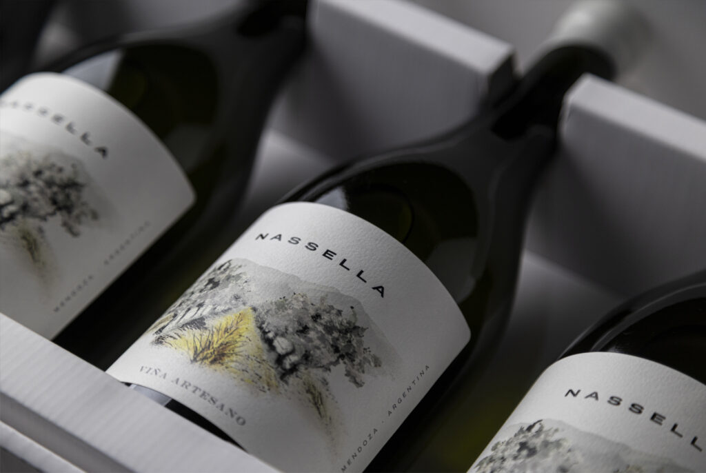
The Brief: Breaking Brand Elasticity The client faced a classic brand architecture problem: limited elasticity.
They needed to drastically separate their mass-market portfolio from their new ultra-premium line.
The assignment wasn’t just to design labels, but to build a universe from scratch: developing the concept, naming, and storytelling, and creating names for the estates that would justify a positioning of high quality and exclusivity.


The Creative Challenge: Technical vs. Everyday
The conceptual challenge was complex: How do you take an element as everyday and romantic as flowers and turn it into something technical and sophisticated? We had to avoid decorative clichés to convey precision, science, and premiumness.


The Solution: A Zoom Sequence
Our answer wasn’t a static image, but an optical journey. We decided to advance through a creative path based on perspective: a sequence moving from Zoom IN to Zoom OUT.
We structured the range’s three tiers as a visual progression:

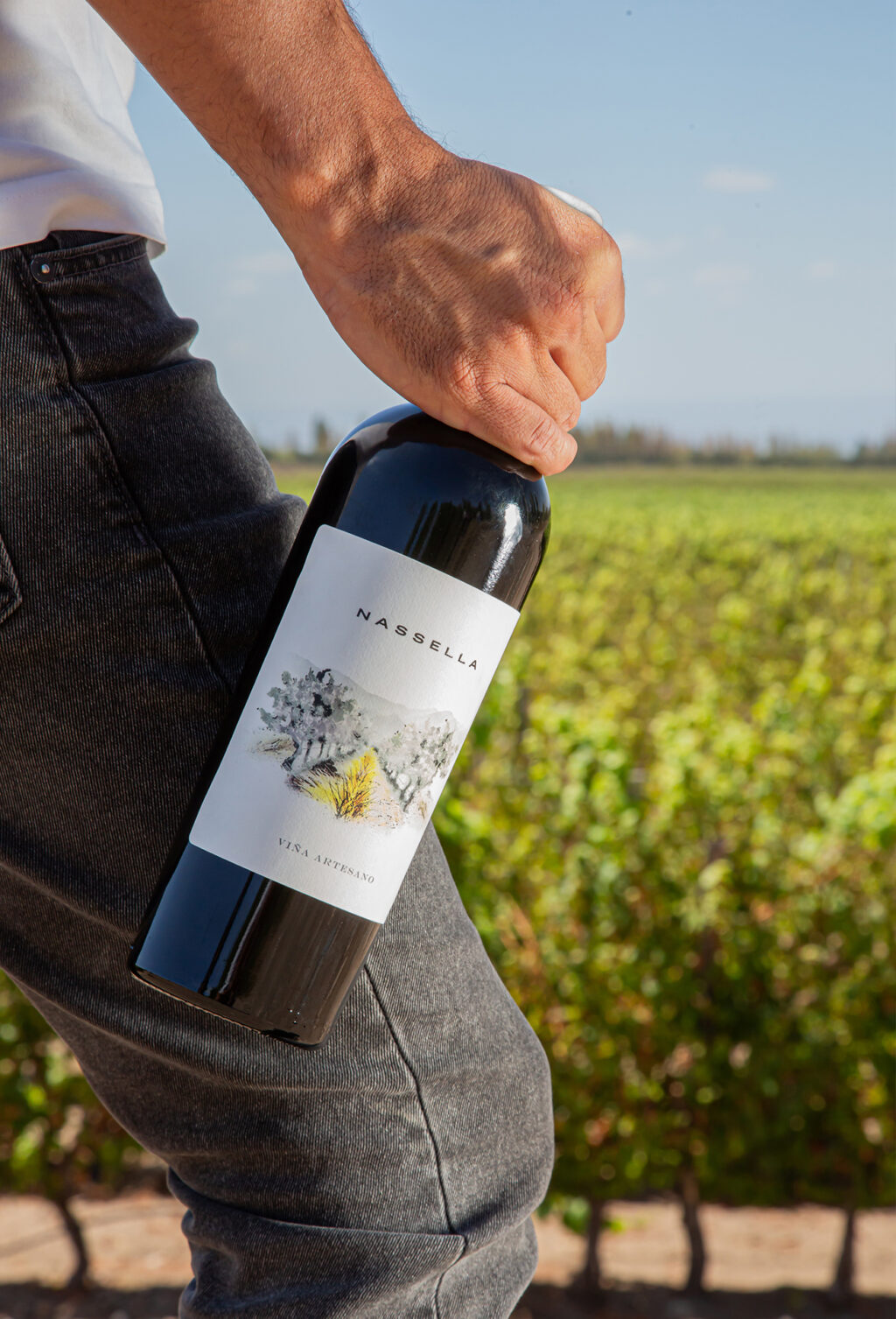
The Result: Craftsmanship and Precision
To materialize this concept, each tier was resolved with a unique handcrafted illustration, providing the necessary organic character. However, the premium finish was achieved through the technical execution of the printing: we strategically used hot stamping, embossing, and high-build tactile varnish on each label.
The result is a family of wines that not only differentiates itself from the mass market but tells a story of oenological precision: from the smallest detail to the grand landscape.